Mobile-First Indexing and Its Impact on Google’s Search Results
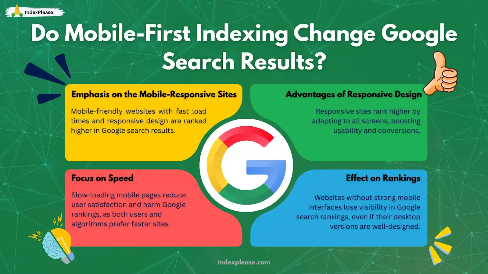
Mobile-first indexing means a website’s mobile version which Google uses primarily to crawl, index and rank. So basically, the first thing Google checks is whether your site even works on a phone. The shift became official on July 5 2024 when Google announced it would stop crawling desktop-only sites; everything from that date forward is discovered exclusively by Googlebot Smartphone. In plain terms, if your mobile version hides content or serves a “view on desktop” splash screen, Google can’t see or rank it.
Why the hard cutoff? Because that tiny screen is now where search really happens. Globally, 63 % of Google queries originate on mobile devices and top-ranking organic results collect a 22 % mobile click-through rate, Semrush’s 2024 benchmark shows 34 Eye-Opening Google Search Statistics for 2025. Users aren’t just tapping links, either. Voice commands, product carousels and AI answer boxes all draw from the same mobile.
For sites that nailed the transition, the reward is clear, faster indexation, richer snippets and prime placement in Google’s shiny new verticals (Discover, Perspectives, AI Overviews). For those that didn’t, the penalty is brutal invisibility.
1. How Mobile-First Indexing Works
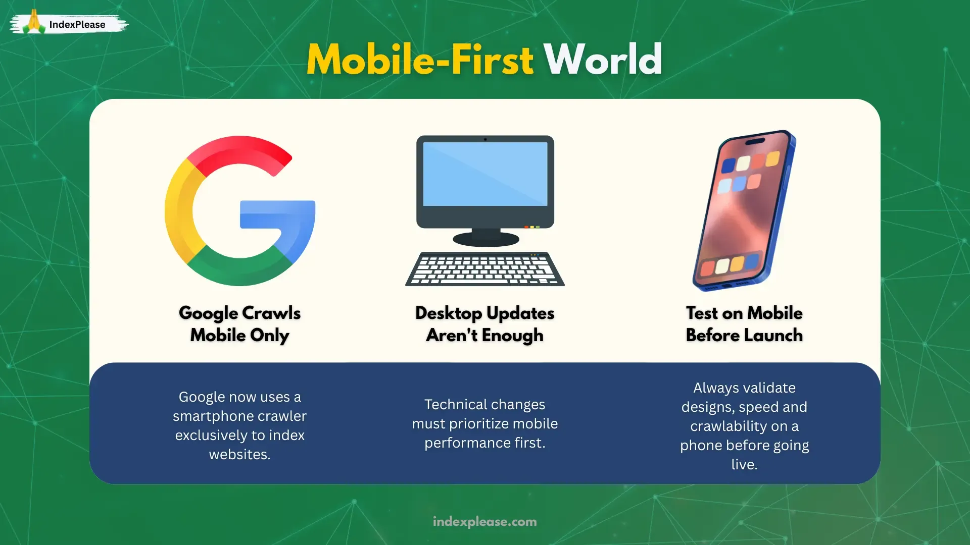
Google has always had more than one web crawler. For years the “desktop Googlebot” did most of the hard work while a smaller “smartphone Googlebot” fetched mobile pages as a secondary check. That flipped in stages between 2016 and 2024 and on July 5 2024 Google officially retired desktop-only crawling for good. From that day forward, every URL in Google Search is discovered, rendered and ranked as if it were being viewed on a phone.
1.1 Crawl Queue: Smartphone Agent Only
Discovery: Googlebot Smartphone requests a URL from your XML sitemap, an internal link or an external backlink.
Fetch & Render: Google downloads HTML, CSS, JS, then runs a mobile browser emulator to see the fully rendered page (fonts, images and buttons).
Index Decision: Parsed text, images and structured-data snippets are stored in Google’s index if they meet quality and spam thresholds.
The desktop crawler still exists for legacy comparison, but Google confirmed in June 2024 that “all indexing and ranking signals now come from the smartphone crawl”.
1.2 Canonical Signals Still Matter
Google’s indexing system needs to know which duplicate URL is “the one.” Canonical clues include:
A single
<link rel="canonical" …>tag pointing at the preferred URL.Consistent internal links that use that same canonical.
Matching mobile and desktop content (no missing paragraphs or images).
Mismatch any of those and Google may choose a different URL or drop the page entirely.
1.3 Rendering Problems Are Ranking Problems
As Google renders JavaScript after the initial HTML fetch, heavy front-end frameworks (React, Vue, Angular) can delay indexing if critical text doesn’t show up right away. Ahrefs’ 2024 technical report lists “client-side only rendering” among the top nine issues that delay rankings.
The fix is simple:
Server-side render the basic HTML shell (title, H1, intro).
Lazy load images below the fold, but make sure the
<img>tags still exist in the source.Avoid infinite scroll unless you have clear numbered URLs or else Googlebot might miss deeper content.
1.4 Crawl Budget & Mobile-First
Google allocates a crawl budget per host, trying not to overload your server. Semrush’s crawl-budget primer notes that bloated redirect chains, 404s or duplicate m-dot URLs waste that budget and delay fresh pages from being discovered. Mobile-first amplifies the issue, if Googlebot must chase extra URLs and render JS for each, valuable new content waits in line.
IndexPlease automatically pings Google’s Indexing API and Bing’s IndexNow each time you publish, so priority URLs bypass the slow crawl queue and hit the index within hours.
1.5 Structured Data Is Copied Verbally, Not Visually
FAQs, HowTos and Video key moments are generated from JSON-LD embedded in your mobile HTML. If that markup lives only on the desktop, Google never sees it.
Checklist:
Same
ArticleorProductschema on both views.Identical
headline,description, andpricefields.Test the mobile URL in the Rich Results Test, not just the desktop one.
1.6 Why This Workflow Exists
| Step | Why Google Does It | What You Must Do |
|---|---|---|
| Crawl with smartphone agent | Mirrors majority mobile user base | Ensure mobile site is complete |
| Render JS after fetch | Understand dynamic content | pre-render critical text |
| Rely on canonical hints | Prevent duplicate clutter | One clear canonical + parity |
| Enforce crawl budget limits | Save resources | Remove dead links, thin pages |
| Use mobile schema only | Feed rich result engine | Copy JSON-LD to mobile HTML |
Mobile-first indexing isn’t just a policy change; it’s Google rewriting its crawl stack around what people actually use to search. Master these mechanics and your pages enter the index faster, qualify for richer features and stay protected from future algorithm shifts.
2. Technical Must-Haves for a Mobile-First World
Google’s smartphone crawler is now the only crawler that matters, so every technical change you make should be evaluated on a phone first. Below are the pillars of a solid mobile-first build, each backed by 2024-2025 guidance from Search Central, Semrush, Moz and Rank Math.
2.1 Responsive Parity: “What You See Is What Google Gets”
Google’s Mobile-Site Best Practices still leads with one rule: show the same primary content, headings and structured data on mobile that you show on desktop. A responsive design satisfies this automatically; an m-dot or dynamic serving setup often does not.
Quick test:
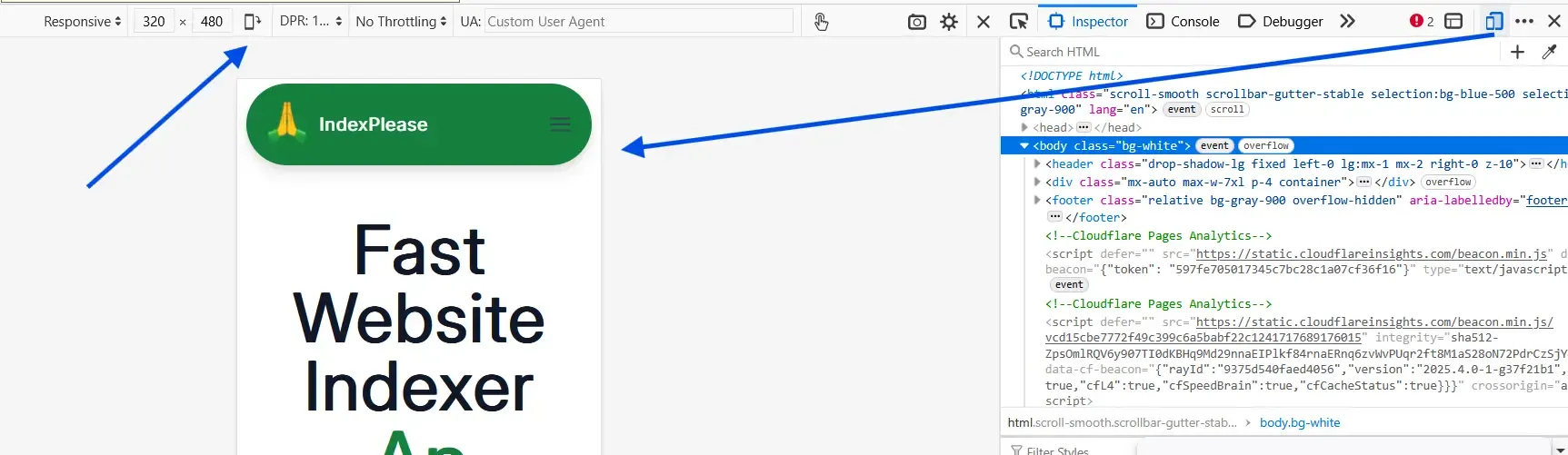
Load the mobile URL in Chrome DevTools > “Mobile” view.
Copy-paste the rendered HTML into a word counter.
Compare the word count to the desktop version. If mobile is missing >5 % of the text, fix it.
2.2 Core Web Vitals
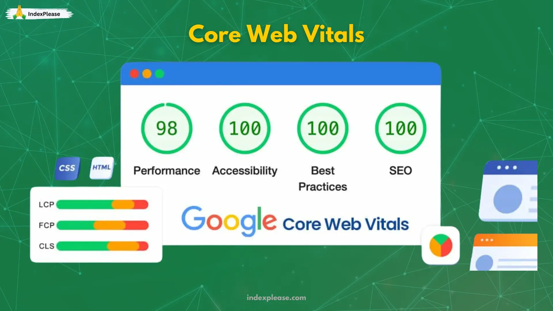
Google retired First Input Delay (FID) on 12 March 2024 and replaced it with Interaction to Next Paint (INP). Pages now need an INP below 200ms to hit the “good” threshold, so every tap feels instant on a phone.
Simple wins:
Defer third-party scripts (chat widgets, tag managers).
Self-host fonts instead of fetching from slow CDNs.
Compress images to WebP/AVIF. Semrush’s PageSpeed guide notes a 25% average savings for sites that switch.
Moz’s 2024 update reminds us that Core Web Vitals are a ranking factor and a UX factor, fixing them increases conversion as well as traffic.
2.3 JavaScript Rendering: Send HTML First, Load Scripts After
Heavy front end frameworks can block Googlebot while it waits for bundles to download. Ahrefs’ 2024 technical report lists “client-side only rendering” among the nine biggest ranking killers.
2.4 Schema & Open-Graph: Make Every Snippet Mobile-Ready
JSON-LD: Copy the same
Article,Product, orFAQPagemarkup into the mobile HTML.Open Graph: Google doesn’t use OG tags for ranking, but TikTok, LinkedIn, X and WhatsApp do. Missing them means ugly, text-only previews and those previews often travel further than the original link.
2.5 Crawl Budget: Spend It Where It Counts
Google still gives each host a crawl quota. Redirect chains, bloated parameter URLs and orphan pages waste that quota, delaying important content.
Quick wins:
Block faceted duplicates with
robots.txtor canonical tags.Trim dead categories (>404) monthly.
Prune thin content. Semrush notes it frees the budget for revenue pages.
2.6 Fast Pings: Let Bots Know Now, Not Next Week
Even with a perfect site, discovery can lag. Paste your sitemap into IndexPlease and every new or updated URL is automatically pinged to Google, Bing, Yandex, Naver and Seznam. No cron jobs or API scripts required. Check your crawl logs a day later; you’ll see fresh “200 OK” hits from Googlebot Smartphone.
Pocket Checklist
| Fix | Tool | Target |
|---|---|---|
| Match mobile & desktop content | Chrome DevTools | 100 % parity |
| INP < 200 ms | PageSpeed Insights | Pass in CWV report |
| Add JSON-LD & OG tags | Rank Math or Yoast | Article/Product/FAQ |
| Remove crawl wasting URLs | Semrush Site Audit | <5 % budget waste |
| Auto-ping new pages | IndexPlease | URLs crawled in <4 h |
Master these five areas and you’ll meet Google’s mobile-first baseline, earn richer snippets and keep crawl budget laser focused on pages that drive revenue.
FAQs
1. Do I still need a separate desktop site once mobile-first indexing is in place?
No. Google now crawls your mobile version only. A responsive design that serves the same HTML to every device is the safest route. Moreover, be sure both mobile and desktop versions carry identical headings, copy and structured data, otherwise Google may index the weaker page.
2. Is AMP still mandatory for Top Stories or ranking boosts?
Not anymore. Google dropped the AMP (Accelerated Mobile Pages) requirement for Top Stories in 2023. As long as your mobile pages pass Core Web Vitals.
3. What site-speed metric matters most after March 2024?
Google replaced FID (First Input Display) with Interaction to Next Paint (INP) on 12 March 2024 and set “good” at ≤ 200 ms. Pages scoring in the green zone tend to rank and convert better on mobile.
4. Is a responsive site always better than an m-dot (m.example.com)?
Yes, unless you maintain pixel-perfect parity. Responsive sites avoid duplicate URLs and canonical problems.
5. Does using a tool like IndexPlease replace my sitemap?
IndexPlease fires pings so new URLs appear in hours, while the sitemap keeps the full site structure tidy for long term crawling.
Final Thoughts
Mobile-first indexing is no longer just an audit item, it’s Google’s default perspective. Pages that load quickly, match content across versions and deliver valid JSON-LD now get rewarded with richer snippets, AI citations and faster discovery.
The good news is that most fixes are straightforward:
Parity: Serve identical headlines, body text and structured data on all devices.
Performance: In Core Web Vitals, hit the new INP (Interaction to Next Paint) ≤ 200 ms threshold and keep LCP (Largest Contentful Paint) under 2.5 s.
Presentation: Add Open Graph tags so social shares (and Google Images) look sharp.
Proactivity: Ping search engines the moment you publish.
That last piece is where IndexPlease shines. Drop in a sitemap or a handful of URLs and the platform fires instant notifications to Google, Bing, Yandex, Naver and more. Pair those automated pings with the technical must haves in this guide and your content will land in Google’s mobile index (and everyone else’s) within hours, not weeks.
Next step: sign up for an IndexPlease trial, connect your sitemap, then check Google’s URL Inspection tool tomorrow. When you see “Crawled and indexed (Smartphone),” celebrate. Use the time you saved to create more content your audience actually needs.